

In a mobile-first world, every new website must be designed with responsive elements in mind.

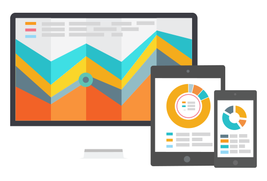
As more and more people use mobile devices to access the internet, it is essential that your website is responsive. This means that it can be easily viewed and used on a range of different devices, from phones and tablets to desktop computers.
Your users are your number one priority, so you need to make sure they have a consistent and enjoyable experience regardless of which device they are using. This is where we come in. We specialize in designing responsive websites that look great on any screen size. Our team of experts will work with you to create a site that perfectly meets your needs and gives your business the professional online presence it deserves.
What is responsive web design?
As the world becomes increasingly digital, it is important for businesses to have a website that can respond and adapt to the various screen sizes of devices being used. This is where responsive design comes in, using fluid grids and percentages rather than absolute pixels or points.
While it may take a bit more time to initially build a responsive website, it will be more cost effective in the long run as you will only need to update and maintain one site. Plus, responsive sites tend to rank better on search engines, so your digital marketing efforts will be more successful.
It’s all about giving users the best possible experience.
We always put your users first and design our websites with their experience in mind. Whether they are on a desktop, tablet or mobile device, we make sure the content is scaled and adjusted accordingly. Most importantly, we want it to be easy to use and navigate so that users can easily perform the desired actions.
When we create a website, we think about your target audience and how they will interact with your site. During the design stage, we will show you wireframes and full-colour mock-ups for different devices, so that you have a clear understanding of how it will look.
Responsive
Design that responds and adapts to the user’s viewing device, whether it be a desktop computer, tablet, or mobile phone.
Tested
Our company specializes in high-quality web design and development. We use an accredited quality management system to ensure that all of our projects meet the highest standards.
User Experience
Design your site to be visually appealing and easy to use on all devices.
Professional
A well-designed website is essential for any business that wants to succeed in the modern marketplace. A responsive design will ensure your site looks professional and is easy to use, no matter what device your customers are using.
Design your website with search engines in mind to ensure optimal results.
Mobile devices are responsible for more Google searches than desktop computers. As a result, Google has implemented a mobile-first indexing and ranking algorithm. This means that when Google assesses your website for ranking, it will use the mobile version of your site.
If you want to stay ahead of the competition, it’s important to have a responsive website design that is optimized for mobile-first indexing. By doing this, you’re more likely to rank higher than those who don’t have a responsive website.

Differentiating your content through marketing, blogging, and social media is essential to success.
You want to make sure that all the content you’re putting out there is seen by as many people as possible. If you’re actively creating and sharing content on your website and social media platforms, then there’s a good chance people will be viewing it on their mobile devices.
You’re more likely to get views and shares if you’re sending users to a responsive website that is quick and easy to use.